Papa Johns
Services
Brand Identity
Illustration
Motion Graphics
Creative Director: Jamie Rayner
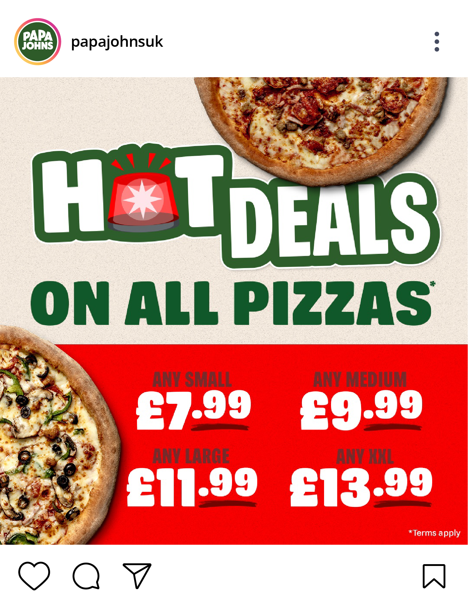
Better Ingredients. Better Pizza.
Across brand identity, motion graphics, and digital content, we helped Papa Johns engage their audience in fresh, impactful ways. From launching British-inspired pizza sides, to playful animations, and eco-friendly tote bags, each project strengthened the brand’s connection with customers while staying true to their core brand values.
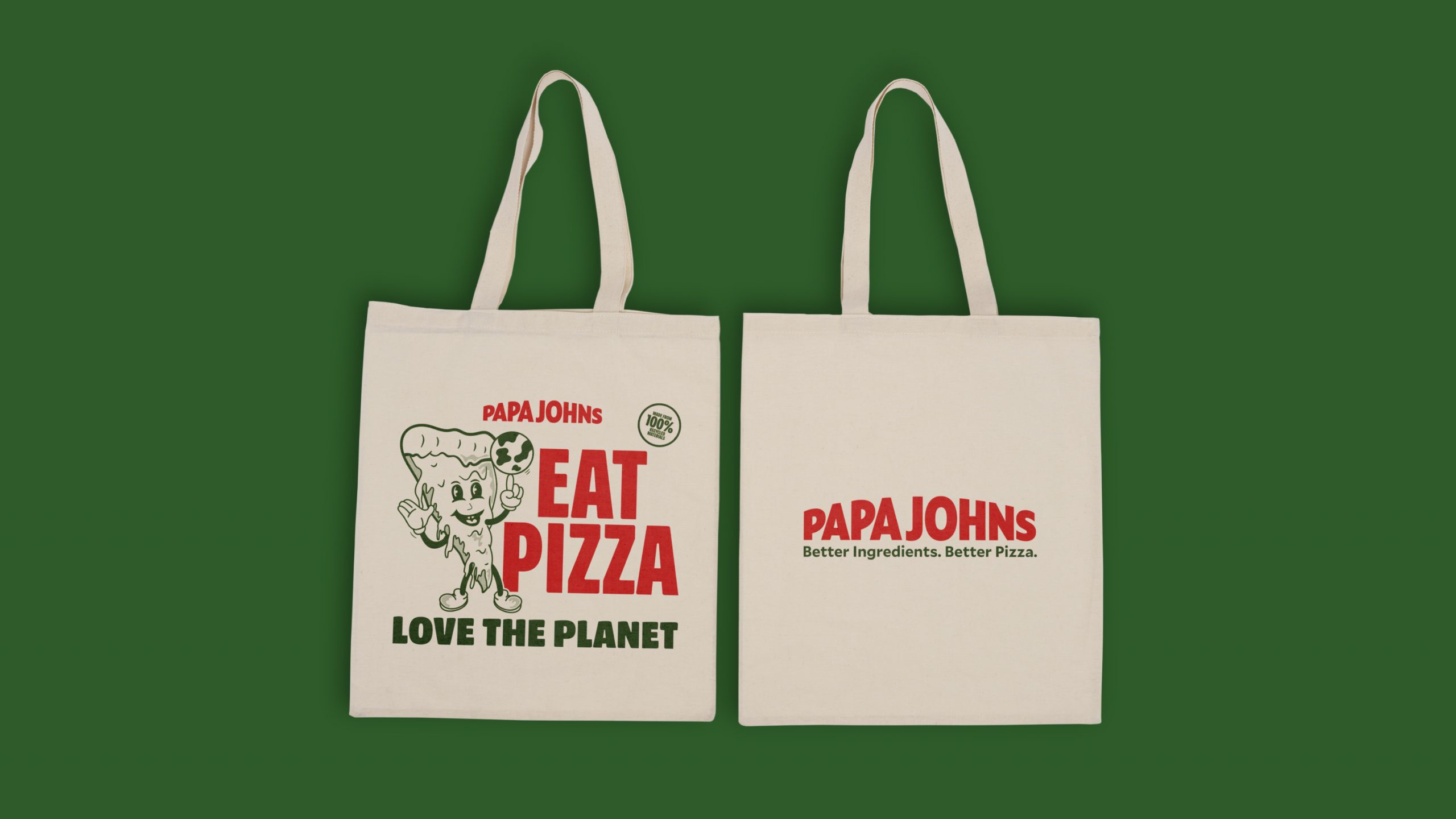
Better for the planet
Papa Johns took their slogan, "Better Ingredients, Better Pizza," a step further - by being better for the planet. We helped them switch from plastic bags to tote bags, featuring bold illustrations that pushed the brand out of its comfort zone. It was a small but meaningful move towards sustainability, giving customers something practical and planet-friendly.
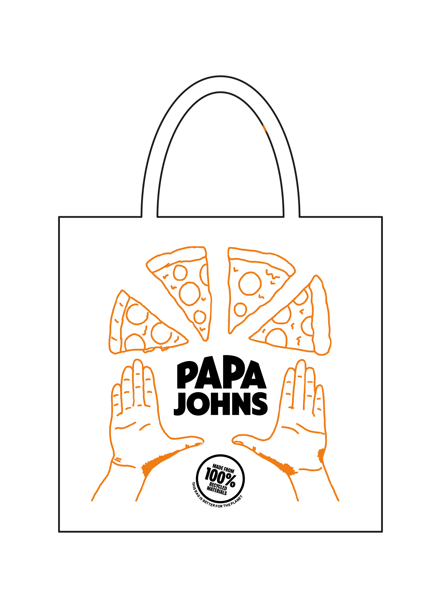
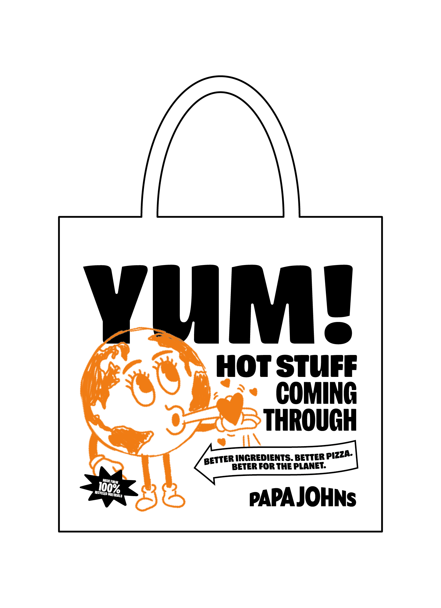

Initial concept sketches.


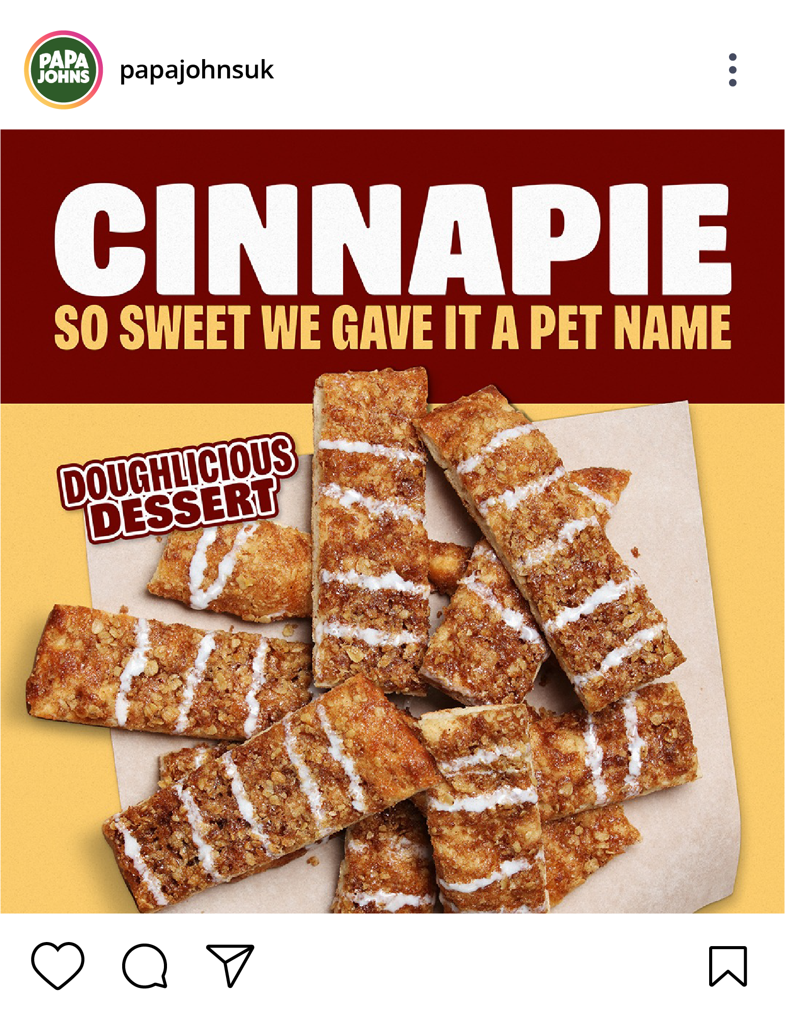
British flavours, new favourites
To celebrate summer and the Jubilee weekend, we helped Papa Johns create something only the British can make - new pizza sides using the iconic flavours of Branston and Marmite. Pizza sticks, one of their best-selling sides, got a delicious twist with this partnership, capturing the hearts (and stomachs) of the nation.
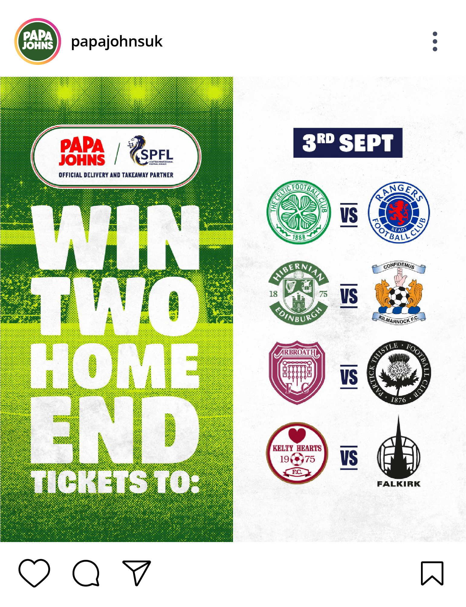
Turning customers into advocates
For Papa Johns, it’s not just about gaining loyal customers; it’s about turning them into brand advocates. We brought this to life through a series of TikTok-style stop-motion animations. This approach helped Papa Johns stay top of mind for their regulars while also reaching new audiences, keeping the brand both fresh and familiar.