THE BRAND
Periods - they're awkward and a horrible experience for many people. This didn't need to look like another stuffy campaign. It needed to make an impact and normalise a taboo subject.
Three logo concepts were pitched, all incorporating the illustrative style, bold lines and colours to create an overall cohesive look and feel for the campaign.


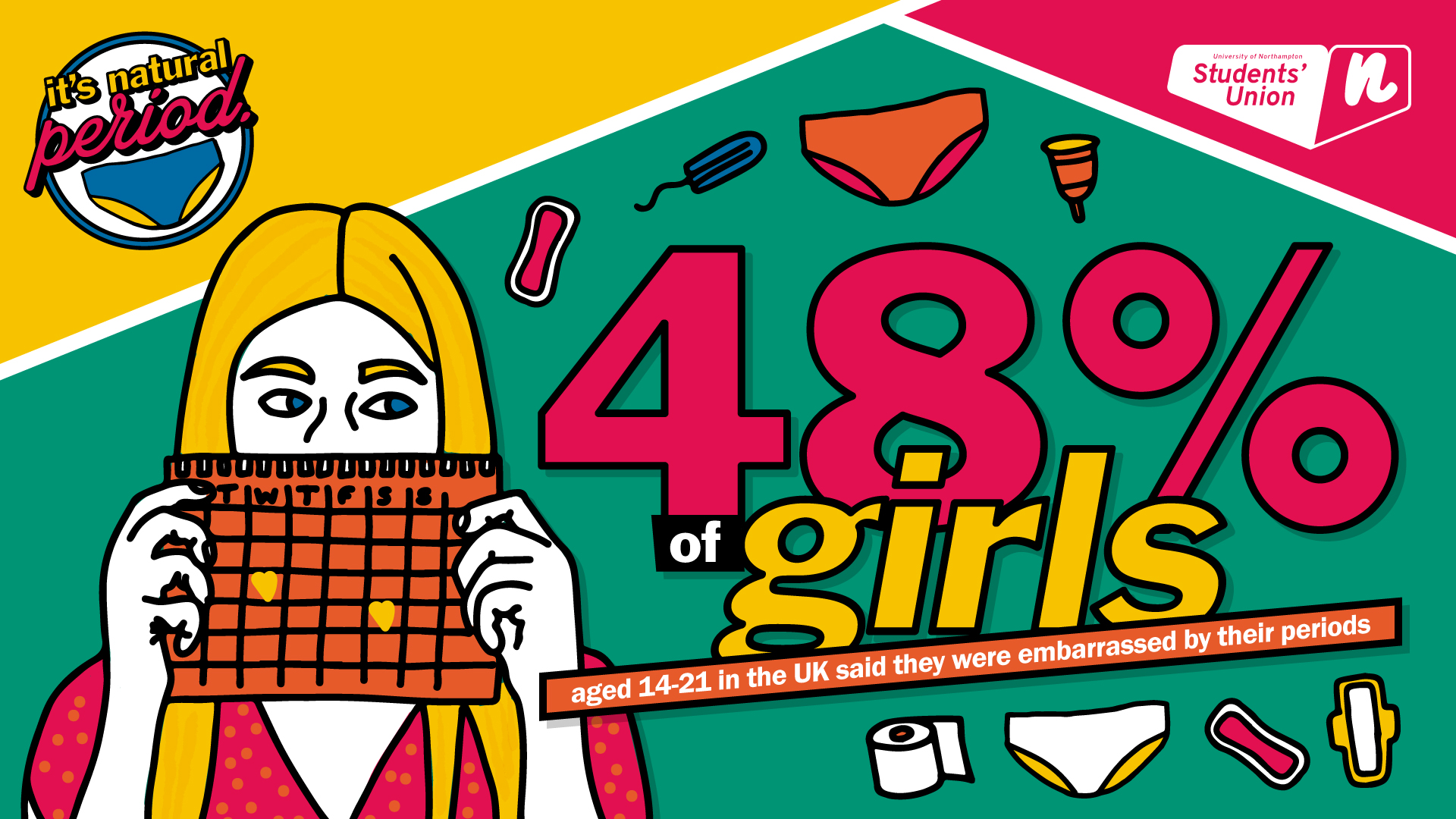
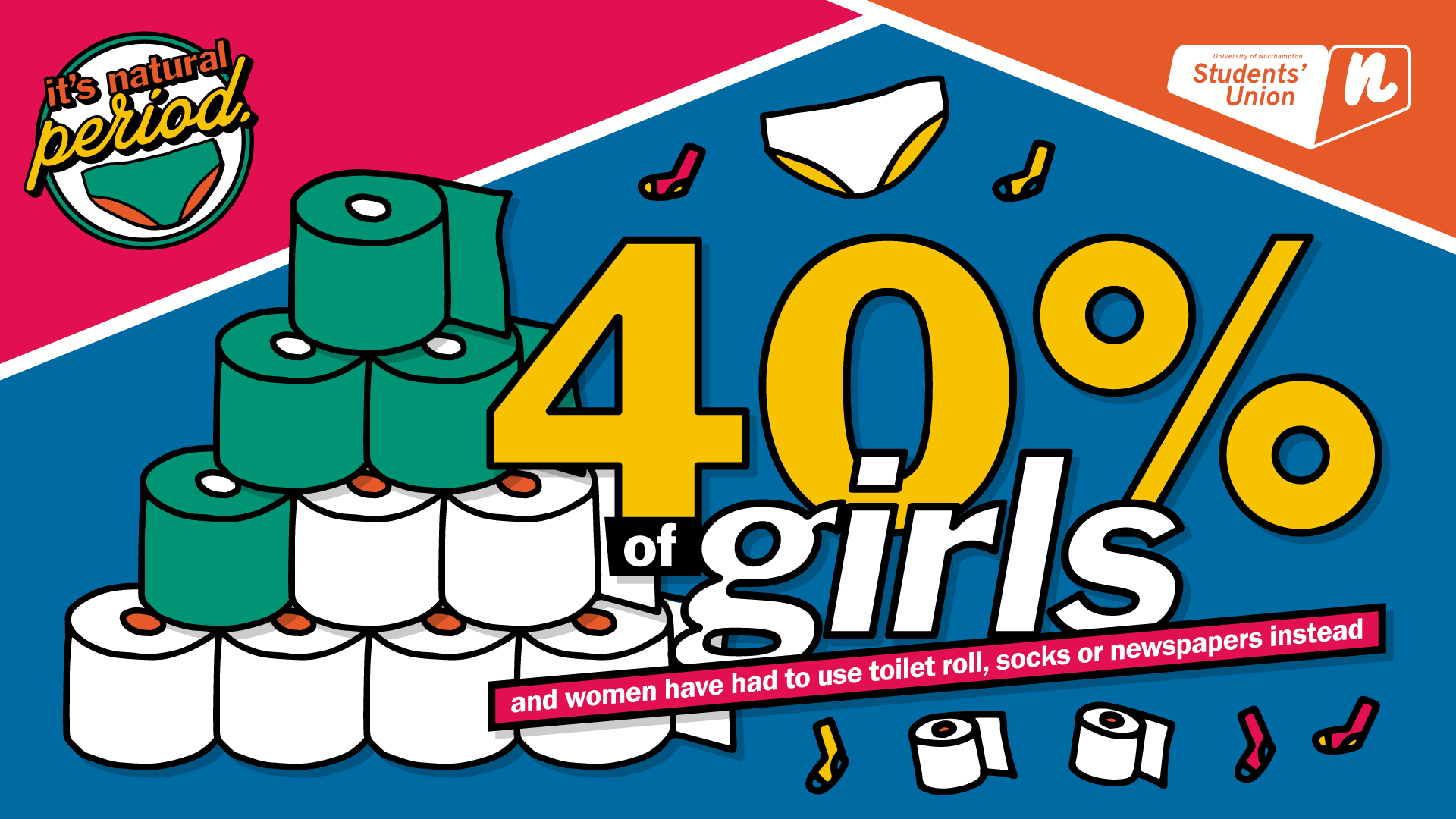
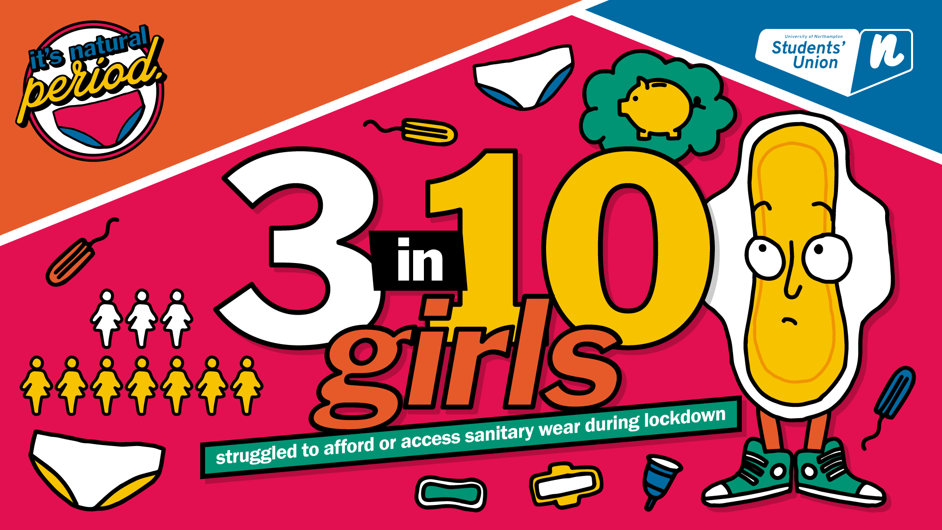
PUTTING IT ALL TOGETHER
Bold colours. Quirky illustrations. Statistics. The three tie in nicely together! The campaign was predominately used across social media and adapted for in-print posters to raise awareness across campus.