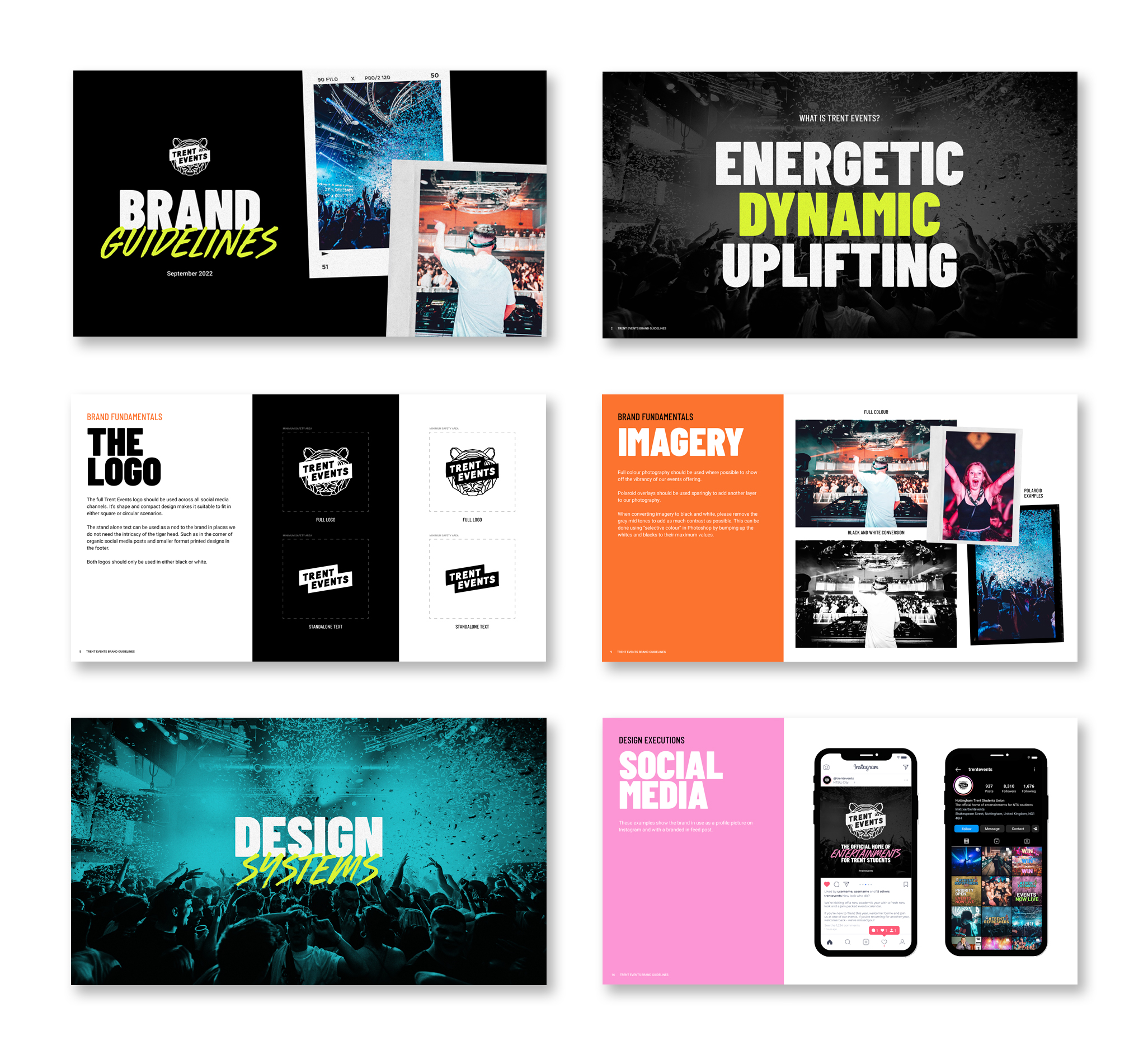
BRAND HISTORY
T-R-E-N-T, we are the Trent Army.
Entertainment at NTSU has had several facelifts over the years - jumping from trend to trend. The latest incarnation of the brand uses neon-inspired text.
In 2022, the strategy for the brand changed and along came a much-needed shift in identity. We took apart the cultural history of entertainment and brought it into a modern and responsive world.
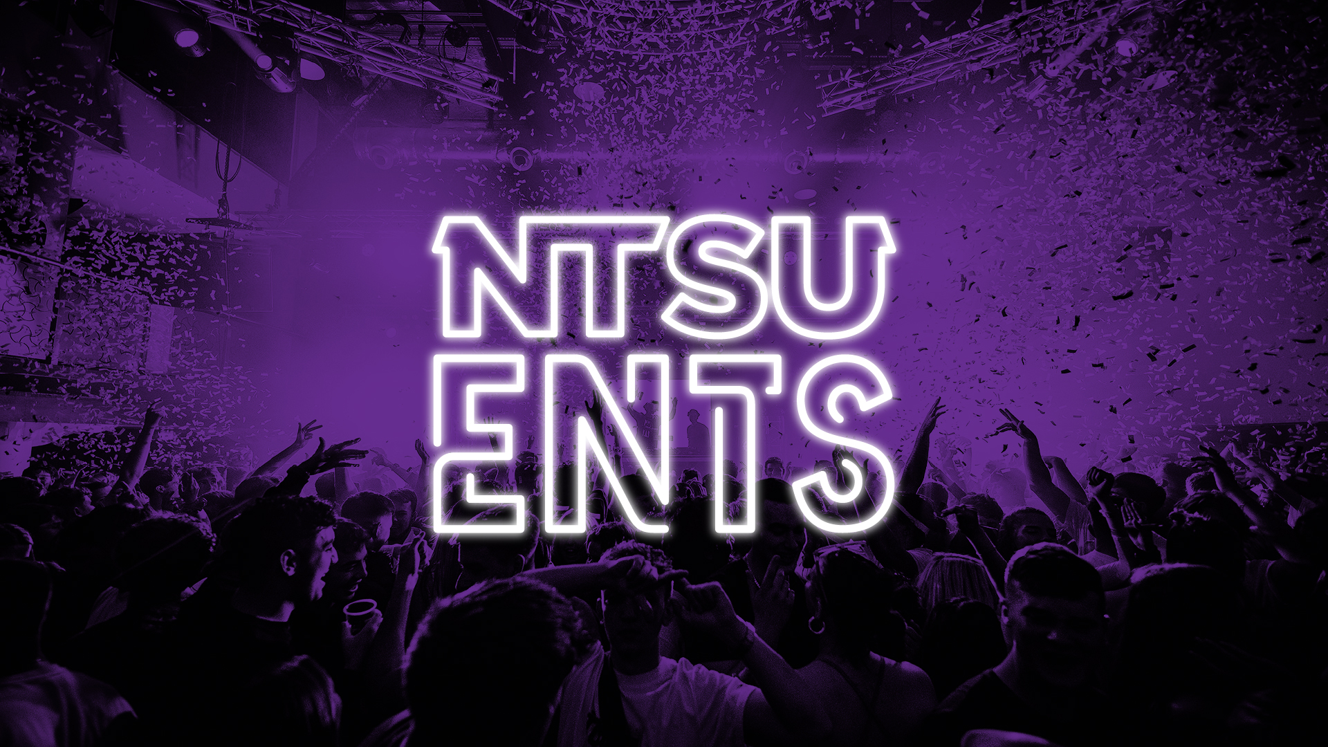
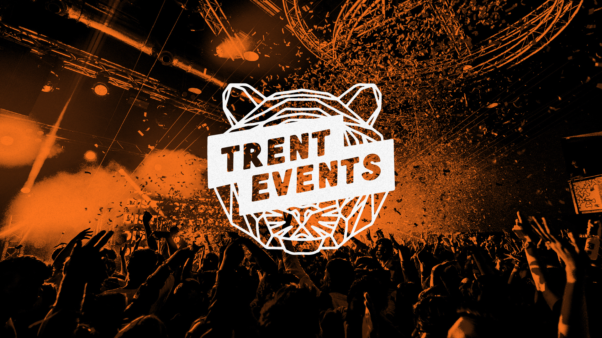
Taking the old neon trend logo to create a brand with its heritage at the forefront, that is equally modern and dynamic to survive in a responsive world.
THE WEBSITE
Moving away from the previous format of hosting all things Entertainments on the main Trent Students UnionCloud website. The Trent Events website was created using Elementor on Wordpress - allowing for seamless handover for in-house staff to manage and update the website themselves with full customisation options.
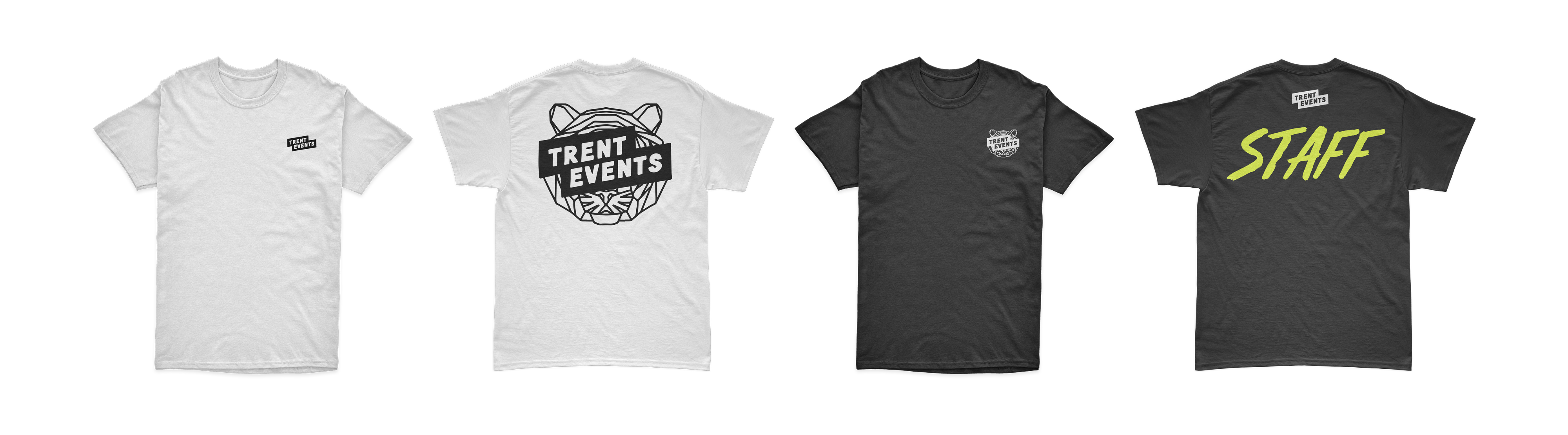
STRIKING COLOUR
Logo? Check. Bold colours? Double check. Events are notoriously dark in colour because of the nature of their working hours. What brings Trent Events to life is their production of lasers and confetti. Thats where the inspiration for brand colours originated from.
It was important that the colours were dynamic to work alongside, and complement, photography. A bold mix of old neon and electrifying tones truly bring the energy of Trent Events to life.